First of all, I thought since I seldom have photos of myself here, I would share this one, above. My friend Kate Beebe took it during my needle felting demo at Quilt Guild this past week.
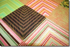
Here are a couple of pictures of Cyndi Campbell’s quilt that I am working on right now. I’ve taken inspiration from the green leafy fabric for the quilting design, plus I am using melon shaped rulers from Kim Brunner for the melon wedges in the blocks. The quilting doesn’t show much on this quilt because of the busy fabrics, but so far I am pleased with how it is turning out. I am using the Dream Green batting again, & I really like how it quilts.
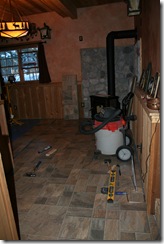
Now here is where I want some opinions. My DH & I have been working on getting this flooring down in his little Bar room.
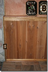
The debate is about the floor trim. Above is one that matches the floor. You can click on the images to see them better. Below is one that matches the wall. Which would you choose? We have a difference of opinion between us & I feel very strongly about it, so I want a majority vote, as someday we will want to sell this house & I think we should try to appeal to more people. Can you guess which way I am leaning?


19 comments:
I like the wood trim.
The quilt looks great, Deb!
definitely the one in the second photo :)
Ilike the one that matches the wall... it allows the top molding to show off and not compete with another color molding before the wall meets the floor. The "pub" is looking good. Great pic of you too!!!
(sorry that was me who deleted.. I had the wrong identity)
I vote for the one that matches the wall.
I vote for the wood to match the wall. We have had this debate in our home recently; we are getting the wood trim. (It is what I want through the whole house)
I don't know about the trim, but I LOVE that picture of you and your great needlefelting sample!
Second photo for sure!
I prefer the trim that matches the wall.
I like the 2nd photo. The trims (top & bottom) match and frame the wall wood beautifully! The wood in first photo just looks out of place. Love the nail heads!
I think it's unanimous Deb. The wall-matching one.
My vote is for the trim that matches the wall!
I vote for the one that matches the wall! The other version is more commercial or industrial looking.
I prefer the one that matches the wall.
The one that matches the wall.
The one that Matches the wall, it just looks better to me
I'll make it unanimous... I like the one that matches the wall!
My vote is for wood trim. There are a lot of textures in the room already so I think the trim should blend in. Nice room!
Great photo of you. I like the wood trim matching the wall.
It's the wood trim to match the wall. You would only bring up something like that for a backsplash...I think
Post a Comment